
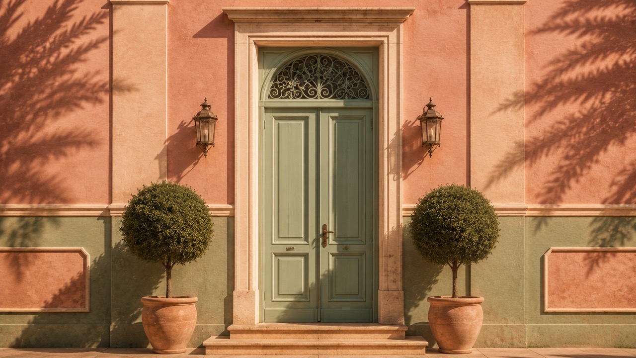
There is a colour — a particular pink, somewhere between salmon and dusty rose, visible in the façade of the Mendl’s bakery, the lobby of the Grand Budapest Hotel, and approximately ten thousand Instagram-worthy café interiors worldwide — that did not exist in the design vocabulary before Wes Anderson put it there. Or rather, it existed in nature and in the paint charts of Farrow & Ball, but it did not exist as a cultural signifier: a single hue that communicates, instantly and without explanation, an entire aesthetic world of symmetry, nostalgia, meticulous composition, and the particular melancholy that attaches to beautiful things that are also, in some essential way, absurd. That a filmmaker — not an architect, not a designer, not a furniture maker — has become one of the most influential forces in contemporary design is a phenomenon worth examining, not least because it illuminates something important about the relationship between cinema and the material world.
The Grammar of Symmetry
Anderson’s visual signature begins with the centred frame — every shot composed with a bilateral symmetry that art historians associate with Renaissance altarpieces and that Anderson applies to hotel lobbies, prison cells, submarine interiors, and pastry shops with equal conviction. This symmetry is not merely aesthetic; it is semantic. It communicates order, intention, and a world in which every object has been placed with a deliberateness that the real world, with its asymmetries and accidents, does not offer. The appeal of this visual grammar to the design world is direct: it proposes that spaces can be composed with the same intentionality as paintings, and that the act of placing a lamp equidistant from two windows is not fussiness but a form of care.
The Palette: Where Nostalgia Becomes Material
Anderson’s colour palettes — the mustard yellows and burnt oranges of The Royal Tenenbaums, the aquatic blues and reds of The Life Aquatic, the pastels of The Grand Budapest Hotel, the earth tones of Moonrise Kingdom — function as emotional registers, each associated with a specific mood, a specific era, and a specific quality of light. The design world’s adoption of these palettes has been systematic and widespread: hotel interiors, restaurant fitouts, retail spaces, and residential projects now reference Anderson’s films as directly as they reference architectural precedents. The phrase “Wes Anderson aesthetic” appears in design briefs with sufficient frequency that it has become a functional shorthand for a set of values — warmth, precision, whimsy, and a relationship with the past that is affectionate rather than reverential.
The Miniature World: Scale as Emotion
Anderson’s films frequently employ miniatures, models, and deliberately visible artifice — the papier-mâché landscapes of The Grand Budapest Hotel, the stop-motion animation of Fantastic Mr. Fox and Isle of Dogs, the cross-section sets that reveal interiors like architectural drawings. This embrace of the miniature and the handmade has influenced a generation of designers and architects who have rediscovered the expressive power of model-making, dollhouse-scale composition, and the particular charm of the obviously constructed. The “Wes Anderson–inspired” hotel room or café, with its carefully placed vintage objects and its visible seams of construction, is an attempt to inhabit a miniature world at human scale — to live, if only for the duration of a coffee or a night’s stay, inside a composition as deliberate and as self-contained as a film frame.
The Anderson Effect on Hospitality
The most visible expression of Anderson’s design influence is in hospitality — the hotels, restaurants, and bars that have adopted his aesthetic with varying degrees of sophistication. The Bar Luce at the Fondazione Prada in Milan, which Anderson himself designed, is the canonical example: a café whose interior recreates the atmosphere of a mid-century Milanese bar with such precision and such evident affection that eating a pastry within it feels like inhabiting a scene. The phenomenon has since proliferated: Anderson-influenced interiors appear in London, Tokyo, Seoul, and Mexico City, each adapting the signature symmetry, the pastel palettes, and the obsessive attention to detail to local contexts and materials.
The deeper lesson of the Anderson effect is not about colour charts or symmetry grids. It is about the conviction — shared by every filmmaker, architect, and designer who works at this level of intentionality — that the spaces we inhabit shape the lives we lead within them, and that the act of composing a space with genuine care is not a trivial pursuit but a serious one. Anderson’s films are, among other things, love letters to rooms, and the design world’s response to them is an acknowledgement that rooms, when loved well enough, love us back.